Merging Diagrams and Illustrations
As part of my research, I looked at how two incredibly different worlds: emotive illustration and static data visualisation, can come together and each shine in one final product. To do this, I have done a bunch of explorations together with Flatland Agency, of which I will share a few with you here.
Example 1: Using buildings to represent numbers.
One of the common used illustrative elements in Flatland's products is that of different buildings. They can be used as background to create depth and scenery, or as reference to the location of the customer or organisation. Because of their simple rectangular shape, they are perfect to integrate data.
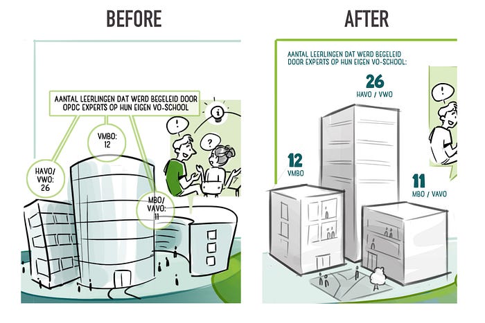
In this illustration for a school community, buildings were already being used to represent different types of schools. The illustration then referred to a specific amount of students within these schools, but did only so through the addition of text and numbers. As an alternative, I have used the buildings as bar graphs, relating the height of each building to the data of students. The buildings are close together and easy to relate and compare. By means of contrast, the first impression says something about the underlying data. The data has been added in text and numbers to give exact information when the viewer continues reading.

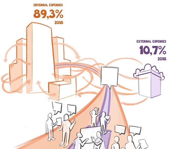
In another project, the buildings were more complex in shape, while the data only included two points (percentages). In this case I used the surface of the illustration, rather than only the length of the buildings. The buildings on the left represent 87,3% of a budget, while the ones on the right represent the remaining 10,7%. This method creates more freedom for creative illustrations, while it pushes the data further to the (cognitive) background, and therefore needing more textual support to correctly inform the viewer.

In both cases we have to be cautious of the distance between illustrations. In most cases the illustration uses perspective, which distorts the interpretation of size. When buildings are too far apart, the perspective could make one look relatively bigger than the data it represents. This is not something that should discourage us, but to be aware of as a design limitation.

Example 2: Arrows in all shapes and sizes
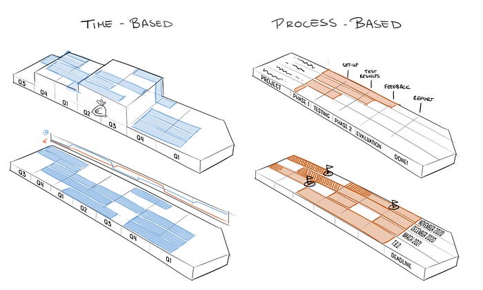
A more abstract element that is often used in Flatland illustrations is the arrow. Arrows can be very useful in depicting a planning or process, often showing different steps or timeframes in which activities should be done. It is important to ask ourselves the question what is most important to show in this case: chronological time-based planning, or progress-based completion. Perhaps you even have a different set of data you'd like to connect to it, such as time and effort required through the process. Through exploration I have illustrated multiple arrows in which a different kind of data takes a center role each time.

Depending on the story, these techniques are applicable to different illustrations, but of course there are many more options of data visualisation. Other topics could be the flow of people or products, networks of nodes, or product market combinations. Are you curious how these techniques would apply to your story? Let me know!
